Tuesday, December 14, 2010
Out of Proportion
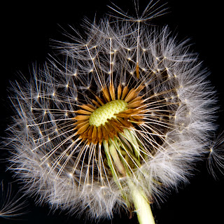
To make something look out of proportion, you have to change one thing, and not the rest. I changed the two little girls and set them on the flower.
Fine Arts Festival Poster
This is for the Fine Arts Festival at Fashion Square Mall. I used the winning piece of artwork and made that the background as well as just having it in the poster. I added the green color and lowered the opacity of the green and the image background so that they weren't overpowering. I changed the blending mode of the image background to Luminosity. I used Dafont to get the fonts that I used.
Thursday, December 2, 2010
David Hockney
David Hockney is an English painter, stage designer, and photographer. He does collage-type images by making one image into multiple images.
Portrait Photography
I changed two of the images to an ink sketch, one of them is a custom shape, and the last one is cross-processed. All three images have different techniques.
Tuesday, November 23, 2010
Downtown Mall
We went to the Downtown Mall and took pictures that were on a scavenger hunt list. We edited our pictures to either duplicate or hide parts of the picture so that it was sort of like a Where's Waldo thing..
Photo Aging
The most important thing to remember when making an aged photo is to choose a picture that looks older and not modern. I used some ripped brushes and used a wrinkled layer.
Friday, November 19, 2010
Collage
I replicated Joe Day. I changed the pipes and the bird. I changed the bird to bears from another piece of his work.
Warm and Cool Hands
Warm and Cool colors change the colors in the picture. Cool colors are blues, purples, and greens. Warm colors are reds, oranges, and yellows. If you have a cool color, the picture will have a blue-ish tint to it.
Glowing Lights
I used the pen tool to create a curved line and then duplicated each layer and turned the curves. Then I used the Gradient Tool to make the colors. I also used the Overlay blending mode
Typography
Typography is the art and technique of arranging type and type design. I made a moose be using the letter C and V to create the head.. I used the letters L and t to create the antlers. The mouth is a U and the eyes are O's that are filled in with black
Thursday, November 4, 2010
Macro Examples
macro allows you to take close-up pictures. i like to take pictures of nature with the macro setting.
Camera RAW
Camera RAW is photoshop's plug-in for editing. it is used to edit pictures quicker and it is non-destructive.
Carter's Mountain
i edited them so that they were color corrected, sepia-toned, or black and white. i added text to one of them by using the pen and text tools.
Wednesday, October 27, 2010
Tuesday, October 12, 2010
Visual Puns
A visual pun is a pun that uses images instead of text..
I created SERIAL KILLER. I got both pictures on Google.
I created a BRAINSTORM. I got the lightning picture and the brain picture on Google.
I created SERIAL KILLER. I got both pictures on Google.
Monday, October 4, 2010
Rule of Thirds Shooting Assignment
I don't have pictures of people, so I added another nature picture. I thought it was pretty easy to take Rule of Thirds pictures.
Subscribe to:
Comments (Atom)


